The client requested designs of web ads for clients Wells Fargo and Ally Bank. The dimensions and copy were provided by the client.
Using modern conventions, come up with ads that resemble the corresponding branding for which each company is known. Use typefaces, colors, and layouts to reflect branding and maximize conversion.
Visual designs for new web advertisements
Solo Project: Visual designs
Sketch, ColorZilla, Font Ninja
Desktop
A few hours
2020
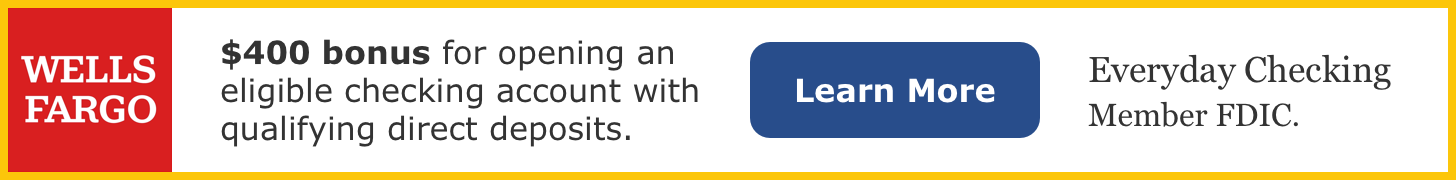
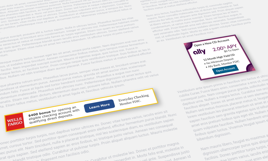
Figure 1: Wells Fargo Advertisement Design (turn off Ad Blockers to display)
The ad was made reflective of its company branding, building recognition for the viewer. I visited the Wells Fargo website, as well as looked through Google Images to get a feel for how its visual elements work together to create an overall aesthetic.
Using the browser plugin Font Ninja, I was able to detect the fonts Wells Fargo uses on its homepage. The main font used was Verdana. I used this in most places for easy reading. The other font used was Georgia. This was used for “Everyday Checking”. It’s still very legible, but is of different focus compared with “$400 bonus” and “learn more”. “$400 bonus” is bolded to grab the viewer’s attention immediately, to inform them of a good deal, resulting in increased conversion.
Internet readers are often just scanning the material they’re looking for, and spending yet even less time looking at ads. Without this bold emphasis working as a focus, it may look like too much copy for the viewer to become interested.
Research was performed to ensure I utilized the most contemporary logo. In the past few years, Wells Fargo has had a series of scandals. Wanting to acknowledge they’re trying to improve, they rebranded, presenting new aesthetics including a new logo.
Using a color picker browser plugin, I copied the yellow/gold color from the Wells Fargo website. I utilized it for a border around the whole ad, making it completely self-contained. This way, the viewer instantly can tell what is and is not part of the ad.
The button color, font family, font weight, and border-radius were influenced by buttons on the Wells Fargo website. While wanting to maintain brand recognition, I experimented with different hues and shades of relevant colors, resulting in a scheme that creates a cohesive, yet contemporary look. This gives a stronger connection to the source material, making the viewer quickly identify the company the ad represents, while incorporating a modern aesthetic.
Figure 2: Ally Bank Advertisement Design (turn off Ad Blockers to display)
The ad was made reflective of its company branding, building recognition for the viewer. I visited the Ally Bank website, as well as looked through Google Images to get a feel for how its visual elements work together to create an overall aesthetic.
Using the browser plugin Font Ninja, I was able to detect the primary font Ally banking uses on its homepage. The primary font used was Lato, which was used here for all fonts, other than the logo.
The current logo was utilized because it provides instant brand recognition for the reader.
Using a color picker browser plugin, I matched the purple and related colors utilized on the Ally Bank website. Four different colors make up the ad border, making the content completely self-contained. The corner designs, influenced by the Ally Bank website, are modern elements used to catch the viewer’s eye and direct them to the advertised offer.
The button color, font family, font weight, and shape were influenced by buttons on the Ally Bank website. This gives a stronger connection to the source material, making the viewer quickly identify the company the ad represents. The button was placed at the bottom, so the viewer is able to take in all the information, and get excited about the offer before deciding to click, resulting in increased conversion.
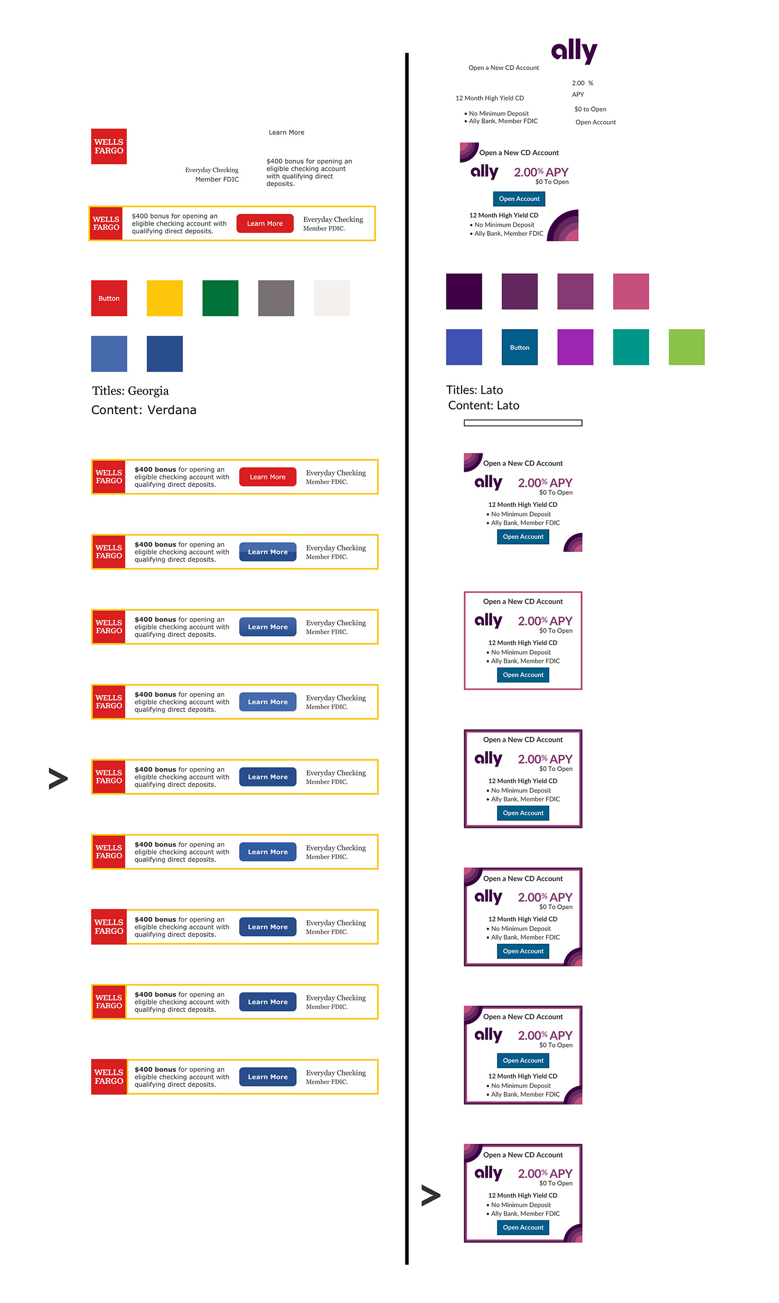
Figure 3: Style Guides and Advertisement Iterations (turn off Ad Blockers to display)
 Top
Top