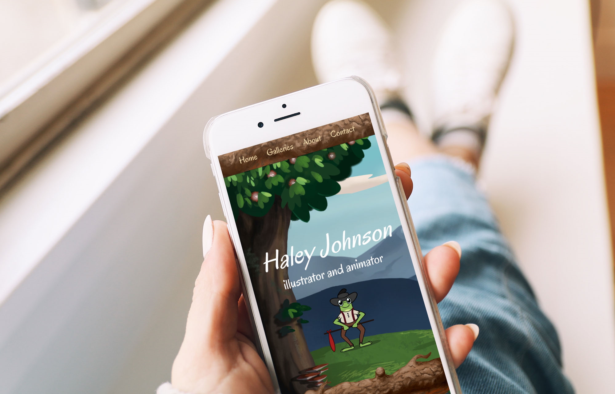

The client wanted a more custom, personal portfolio website built from scratch. She needed to showcase her artwork and requested I design and build her website.
Design and build a new portfolio website that captures the client's artistic aesthetics and displays her work in an easily accessible manner.
Live portfolio website for illustrator and animator
Solo Project: UI Design, Development
Photoshop, Sketch, HTML, CSS, JavaScript, Node.js, Express
Desktop, tablet, phone (responsive)
~2 months
2018
I knew this would be a great opportunity to work in tandem with a client to acquire assets and incorporate an overall design reflecting her aesthetic.
Something I wanted to keep in mind for this project was to make the client’s personal aesthetic come through in the overall design of the website itself. Even the name of the website, Antlers and Acorns, reflects her style and subject matter. The client’s work has an emphasis on woodsy forest creatures. She provided her own work for main backgrounds of the site, as well as the log that separates the header from the rest of the page. It was my job to then develop the site, incorporating these assets in a way that was responsive.
With phone usage so prevalent today, it’s imperative for websites to work on any size screen. One of the most difficult parts of this project was making the site responsive. Respecting the client’s time, I needed to find ways to work with the backgrounds provided and not have her create different background assets for each screen size. To do this, I used media queries that captured the best parts of the background at different screen sizes. This consisted of focusing on the middle of the screen, then shifting the background to the left, and changing font sizes and colors for smaller screens.
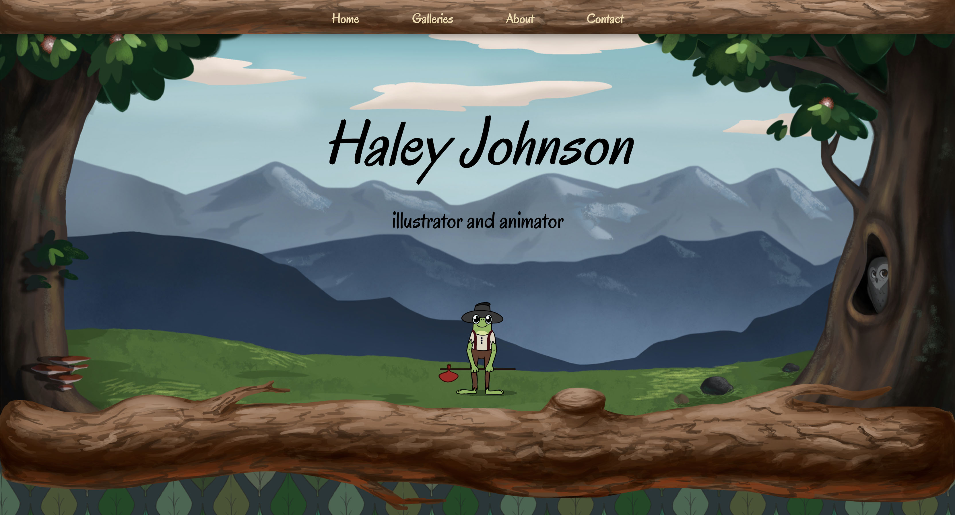
Figure 1: Desktop Background
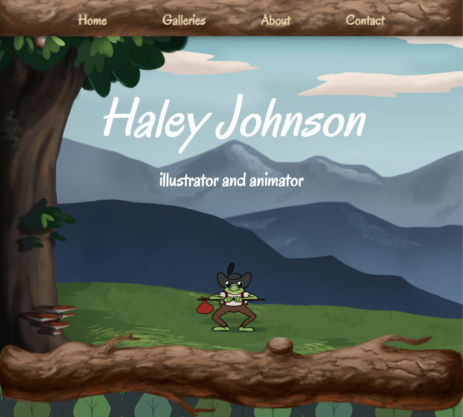
Figure 2: Tablet Background
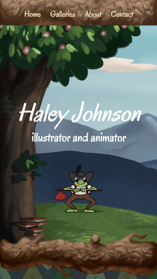
Figure 3: Phone Background
Another challenge was editing the client’s animated frog to feel more like it belonged in the background in which it was placed. The dancing frog (front and center of the heading) initially didn’t have a shadow that made it feel part of the provided background. Using free software I found through googling, I was able to take her gif file and split it into its original, separate still images. With Photoshop, I then recolored the frog’s shadow in each frame to be a dark green, instead of the original grey. Using additional free software from googling, I found a gif maker and put all the individual frames back together. The end result makes the frog look more like he belongs in the background he’s been placed on.
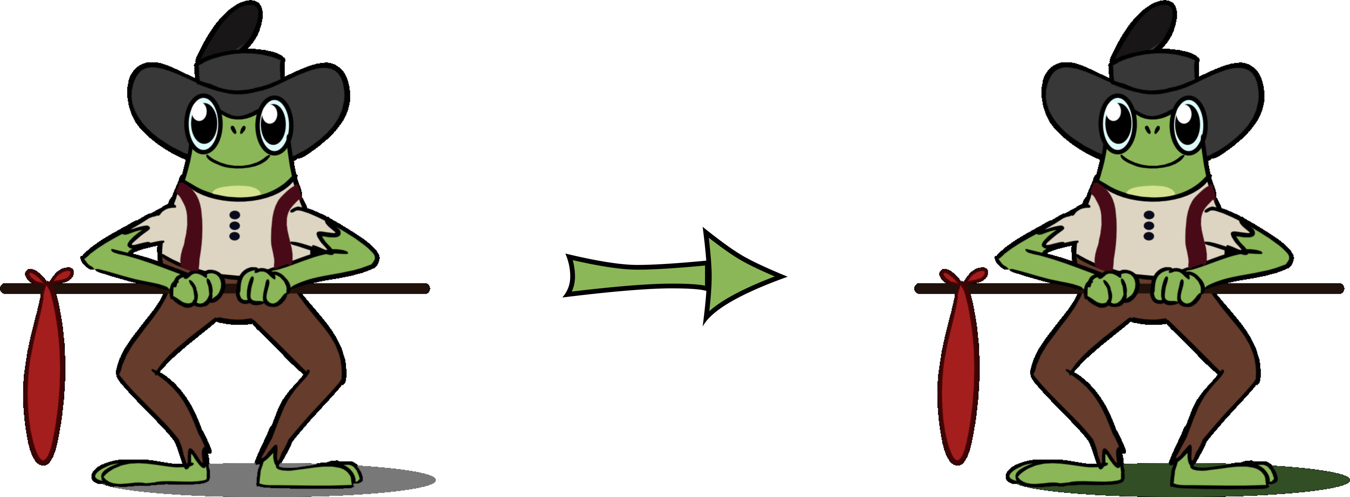
Figure 4: Recoloring frog's shadow frame by frame
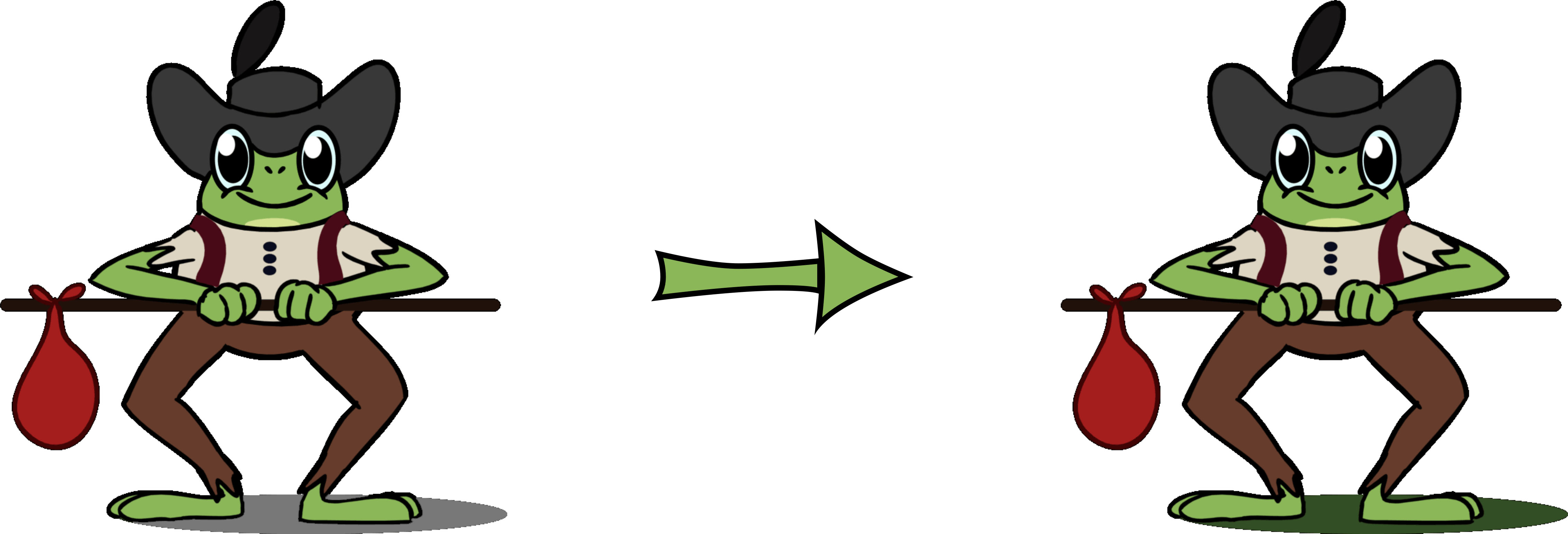
Figure 5: Continuing to recolor frog's shadow frame by frame
I will continue to work with the client to update her portfolio with new content, always ensuring the site follows her aesthetic and modern conventions.