The live SCIFTS website is outdated and has functionality, visual design, and information architecture issues.
Create new UI design based on research that aims to improve the usability and visual aesthetics for the current SCIFTS website.
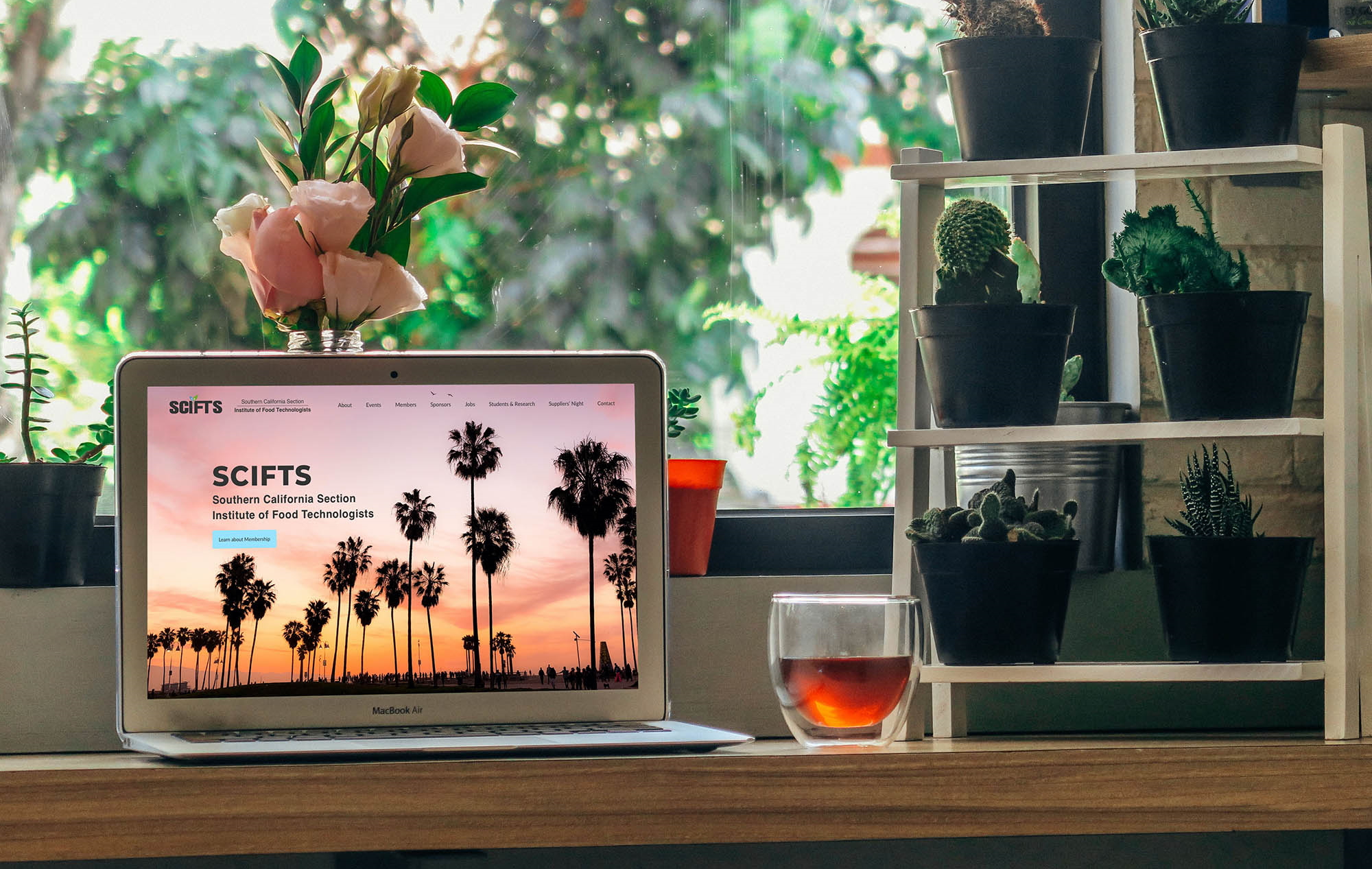
Case study & website redesign for SCIFTS
Solo Project: UX Design, UX Research, UI Design
Sketch, Photoshop, Illustrator, InVision
UI designs for desktop / laptop
~6 weeks
2019
The Institute of Food Technologists (IFT) is an international organization, founded in 1939 as a non-profit society. With over 23,000 members, the organization involves those working and studying food science, technology, nutrition, and related topics in industry, academia and government.
The Southern California Institute of Food Technologists (SCIFTS) is one of the largest sections of IFT. SCIFTS puts on local networking events and talks of topical interest, funds student scholarships, and helps advance the science of food in Southern California.
Visit the current, live website (not my version) at scifts.net
I was a member of SCIFTS for some time, having studied and practiced Food Science for a number of years. I continue to have an interest in the food industry and have a desire to see SCIFTS offer the best informational resources it can.
Revitalizing the SCIFTS website allows me the opportunity to combine my past experience in Food Science with my current practice in UX Design.
The site is used to gain information on organization meetings, guest speakers, and other events, as well as to post advertisements for food company sponsors and provide contact information for SCIFTS board members. The target population for the site is SCIFTS members (including board and committee members) and prospective members. However, it is also used by anyone else who is seeking information about the organization so they can hold an event, become a sponsor, advertise, etc.
There is no true competitive landscape as SCIFTS is the only IFT organization in California. This is the one digital platform SCIFTS currently uses as its official website to connect its members and it doesn’t truly compete with similar organizations.
That being said, there are similar non-profit organizations, such as NCIFT (Northern California Institute of Food Technologists) or IFST (Institute of Food Science and Technology). Exploring a competitive analysis on these similar organizations could still yield beneficial insights.
Not long ago, I visited the SCIFTS website and noticed it looked pretty dated. Having studied web technologies and design in recent years, I saw the site with new eyes. Looking a bit “dated” is one thing, but I wanted to see if the site could be revitalized by a design revamp.
Further analysis concluded that the SCIFTS website could definitely benefit from research and improvement. In addition to looking very outdated, the site had other real problems. There are multiple links throughout the site that simply don’t work (i.e. nothing happens when you click them). A lot of links just look like normal text - they have no indication they are even links until you hover over them.
The site’s photos are fuzzy, stretched out, or have poor resolution. The sponsors’ logos are of particularly low resolution, which is not the representation I imagine these sponsors would think is ideal. The overall site’s current logo could use a graphical update/alteration. The site is also missing certain modern conventions described in Jakob Nielsen’s Usability Heuristics, such as Visibility of System Status. For example, when you click on a navigation bar’s link and takes the viewer to a new page, the link shows no indication of which page the viewer is now on. I also noticed the animated advertisers’ logos worked on Chrome, but did not work on Firefox.
Finally, I discovered that the site does not have a separate experience for mobile, leading users to try to read very small fonts. Mobile is now a recognized requirement for any legitimate organization that wants to be taken seriously. While designing a mobile version is indeed important and acknowledged, this particular project will focus on the desktop version.
Figure 1: Image from current site looks washed out
Figure 2: Image from current site uses questionable filter
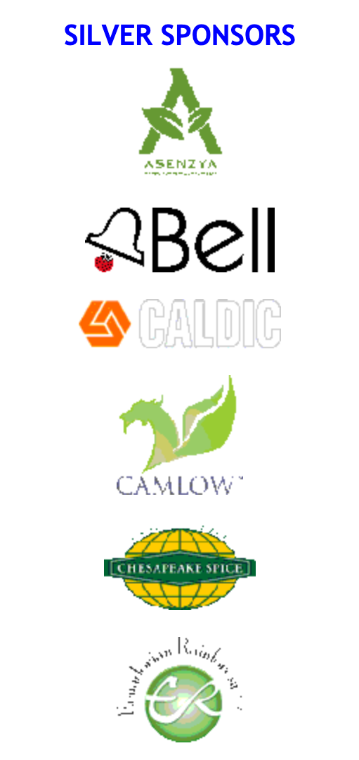
Figure 3: Sponsor logos are low resolution
Figure 4: Current logo needs an update
Figure 5: Navigation bar shows no indication of which page the user is currently visiting
As can be seen from the above figures, there are many aspects to fixing the problems of the current platform. Links should be given new aesthetics and buttons will be added to denote exactly what the user can do to get to new locations. New, higher resolution images should be added to enhance the emotional response and improve food company advertisements.
All these problems will be addressed to improve the user experience. With research and testing, even more issues and their corresponding solutions may be discovered.
The first big step in solving the problems of the current SCIFTS website was to interview those using the current system. Understanding the experience of users who are familiar with the SCIFTS website, as well as those new to the site, is crucial to developing the most useful redesign.
- Determine the biggest pain points for users of the current system
- Determine if there are additional features or requirements that could be beneficial to the platform
There were a few ways to recruit participants for researching users’ needs of the SCIFTS website. I reached out to former Food Science classmates and colleagues who are current members of SCIFTS. I also reached out to SCIFTS board and committee members. This was accomplished through my current contacts, emails found on the website, and Facebook. I found it was also beneficial to test with non-members as they have different perspectives.
Combining data from user interviews and contextual inquiry, I formed personas to guide and inform the design process.

Sandra Flores
Age
Location
Profession
Marital Status
Kids
22
Santa Monica
Recent grad
Single
None
Bio
Very recently graduated from Cal Poly Pomona with a Bachelor of Science in Food Science. Moved back
home
with her parents temporarily while she continues to job hunt for a product development position.
Desires and Values
- find a job where she can practice her creativity in a food science position, ideally within a 40
minute drive
- meet new friends because she moved back home from college and most of the friends she grew up with
have moved away
Frustrations
- struggling to find a job
- not sure how to best meet other locals in the food industry
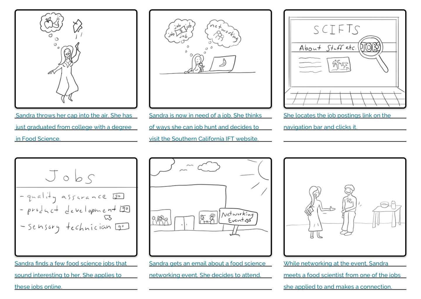
Sandra has been applying to jobs from her parents’ home in Santa Monica. She found out about SCIFTS through the Food Science club at her college. She googles SCIFTS and the SCIFTS website is the first result. She goes to the website and signs up for SCIFTS membership on the “membership” tab. Clicking on the “job posting” link in the navigation bar, she searches for local jobs and fills out a few job applications. She later gets an email for a networking event for SCIFTS members.
Bringing her resume with her, she goes to the event and chats with the people around her. She runs into a food scientist from one of the companies she applied to and gives him a physical copy of her resume. Sandra makes a great in-person connection, and the food scientist is impressed, now putting a face to the applicant. Sandra’s use of the SCIFTS website made it possible to make new job-related connections.

Brian Murphy
Age
Location
Profession
Marital Status
Kids
54
Laguna Beach
Flavor Chemist
Married
2 kids
Bio
Earned his Bachelor of Science and Master of Science in Chemistry from UCLA. Moved with his family
to Laguna Beach twenty years ago to take a Flavor Chemist position at a flavor house that focuses on
organics.
Desires and Values
- continue working at his company that values honesty and organics
- seeks to go to events and meet new people to learn the latest information
Frustrations
- trying to compete with other companies that deceive their customers and label artificial flavors
as natural (a money-saving deception)
- trying to find other local chemists to band together, reinforce transparency and honesty, and stay
informed on the newest organic flavor practices and regulations
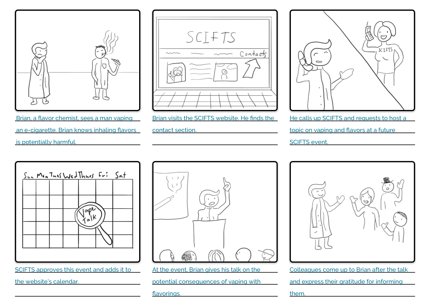
Brian has been looking for additional ways to connect with other flavor chemists and discuss business ethics. He has been hearing about competitors making flavors for vaping, a relatively new segment in the nicotine industry. Brian likes the idea of providing a safer alternative to smoking, but knows that the FDA-approved chemicals he uses in food products are not approved for heating and inhaling, as one would do in vaping. Brian has been a member of SCIFT for years, enjoying connecting with other local industry colleagues.
Brian explores the different events coming up and decides to reach out to SCIFTS about running a topic for a SCIFTS event. Finding the “contact” link on the navigation bar, Brian reaches out to the email provided and requests to have a talk on the safety of flavor and vaping. SCIFTS agrees and the event is scheduled for a couple months away. At the end of the event, after Brian has said his part, multiple colleagues come up to him and express their gratitude for the information, saying they will consider ceasing vape flavor production at their facility.
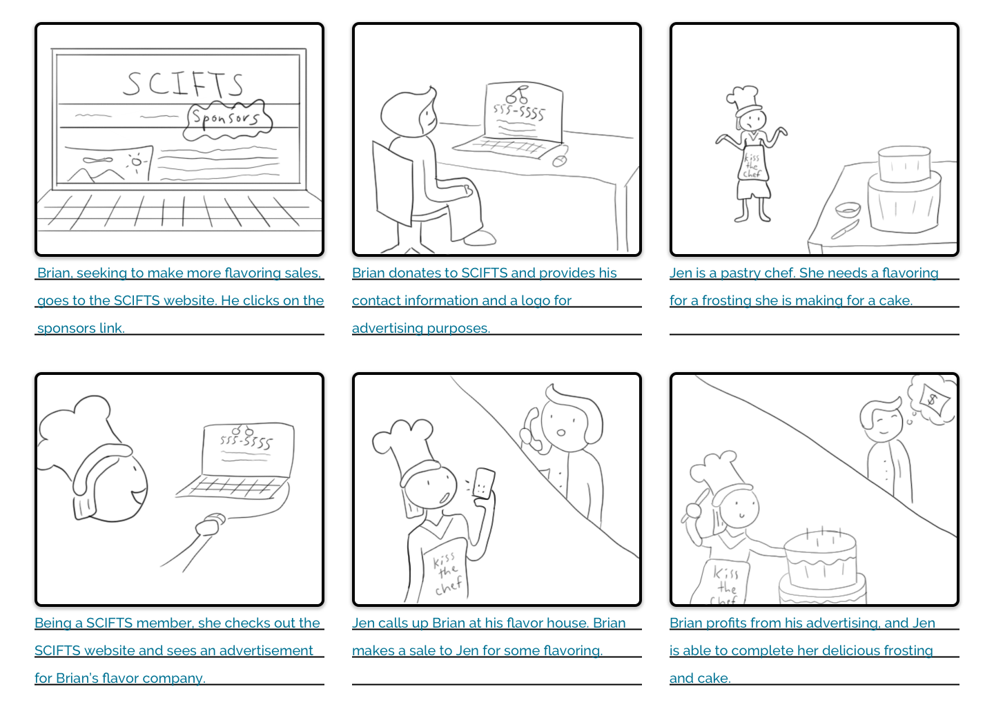
On a subsequent visit to the SCIFTS website, Brian notices the “sponsors” link on the navigation bar and visits the page. He sees other companies, including other local flavor houses, are advertising on the page. Brian contacts SCIFTS, requesting to be a sponsor. Brian’s use of the SCIFTS website made it possible to share his flavor and health expertise with the community and also help sponsor SCIFTS, providing Brian’s company with advertising on the SCIFTS website.
The website’s primary goal is to fulfill the SCIFTS mission statement: “to fulfill human needs for a
quality food supply through science, technology and education.” In other words, the SCIFTS website needs
to provide information to its members, sponsors, and guests about:
- meetings
- events (calendar)
- membership requirements
- provide information on sponsors and their contact info (along with a company logo)
- who the board members are and how to contact them
Since there is a live SCIFTS website, the current practice for SCIFTS members is to use that. Users are somewhat able to find information they need, but not efficiently. Problems with links and unintuitive information architecture prevent users from finding what they need in a timely manner or at all.
If users can’t accomplish what they want, sometimes they visit other resources such as ift.com (SCIFTS’s parent organization). There, they can find additional features such as job postings, information on different food science divisions, and food science news, though not necessarily at the local level.
- need a new SCIFTS logo
- membership requirements: have a page dedicated to paying dues and go through the sign up process
- provide information on sponsors and their contact info, along with their company logo
- provide board members and how to contact them: list with helpful details
- provide SCIFTS direct contact information as well as social media links
- need description of membership benefits
- bigger and more consistent font sizes
- calendar section should look like a calendar (chart style)
Nice to haves:
- add news / industry innovations / industry interest page
- explain what it means to be an advertiser
The website designs should avoid:
- clutter
- redundancy: no need to have a bunch of the same things on each page (header, navigation, and footer
are exceptions)
- poor resolution and awkward graphics (images, logos)
- links that don’t work or aren’t obvious that they are links
As previously discussed, there aren’t any true competitors for SCIFTS because it’s the only IFT sub-organization in Southern California. However, it is still beneficial to compare with parallel organizations to gain insight. The most directly relevant organization is NCIFT, the Northern California Section of the Institute of Technologists. Below, the SCIFTS and the NCIFT websites’ information architecture is compared and analyzed.
SCIFTS’s navigation links:
- Home (often seen as redundant as there should be a SCIFTS logo at the top which would do the same
thing)
- About
- Advertising (maybe change to sponsors?)
- Calendar (construct to look more like an actual calendar)
- Member Login (is this necessary?)
- Membership
- Photos (should be removed - can be added back in if someone actually has photos to add, necessitating
this page)
- SCFIC
- Student Affairs
- Suppliers’ Expo
NCIFT’s navigation links:
- Home
- Events
- Membership
- Hornblower (NCIFT newsletter)
- Jobs (definitely something to consider adding to SCIFTS)
- Grants & Scholarships
- Executive Committee
- Suppliers’ Night
- Advertisers
- Contact Us
I liked the idea of adding a contact page to the links. Having the executive committee (and any board members, etc.) contacts on its own, separate page is a good idea. SCIFTS’s current site has these on the About page, which isn’t particularly intuitive.
NCIFT didn’t appear to have any social media links (at least that I could find), which I thought was surprising, but in general, their website looks professional and current. There’s a header at the top with a navigation bar underneath. The content is below that and has a footer at the bottom. It seems to follow all major modern conventions.
I thought the aesthetics could be a bit more lively as it has a lot of grey. The colors don’t seem to have much cohesion: orange, a somewhat dark blue, and olive green. That said, overall, I thought NCIFT to be a great reference, and I referred to it throughout the design process.
The purpose of this test was to find pain points in the user experience for the revised SCIFTS website designs. This test featured participants performing tasks, reflecting some of the activities users would want to accomplish when visiting the website. These tasks were determined based on the earlier interviews, which informed the needs of the website. Tasks completed involved signing up to be a member, finding out the address of the Golf Tournament event, obtaining the email for the person in charge of SCIFTS social media, finding a website URL for a flavor-producing sponsor company, obtaining the phone number for a company for a food scientist job position, finding how much grant money was provided for research, finding how many different sponsors there are for Suppliers’ Night, and locating the SCIFTS official email.
I sought out participants by reaching out to people I knew had used the current, live website and had an interest in wanting to see it improved. I knew it was important to have participants who already use the website to reveal if anything in expected, normal use was missing or caused efficiency of use problems. I also reached out to someone who has a Master of Library and Information Science. This participant was intended as a third party who wasn’t influenced by previous use of the current site. This participant’s background in information science provided valuable feedback.
- Wireframes were developed using Sketch design software
- Wireframes were made interactive with InVision software
- Macbook Pro Laptop: used by participants to access the wireframes and perform the tasks
- Present consent form and have participants sign
- Go through script with the participant
- Have participants perform the tasks
- Participants fill out the posttest questionnaire
- Debrief and thank the participants
1) You’ve heard that networking at SCIFTS dinner meetings is a good way to get more involved in the food science community in Southern California. Find the IFT page where you would sign up to be an Institute of Food Technologists member.
2) You and your friend are about to leave work for the SCIFTS Golf Tournament event. You want to check the address of the golf course for the event one more time before you leave. What is the address of the golf course?
3) You posted a question about SCIFTS on the SCIFTS Facebook page but no one has responded. You’d like to reach out to the person who is in charge of the Facebook page. Find the email for the person in charge of SCIFTS social media.
4) You need a powdered flavoring for a product you’re working on and want to support companies that sponsor SCIFTS. Find a website URL for a SCIFTS sponsor company that fulfills this goal.
5) You’re wanting a new food science position at a company in Los Angeles. You have about 3 years experience. Find the phone number for a job contact for a food scientist position.
6) You’re interested in learning more about grants awarded through SCIFTS. You’re curious about a ballpark of how much money might be granted to someone. Find how much grant money was awarded to Dr. John Smith.
7) You’d like your company to be a sponsor for the upcoming Suppliers’ Night Expo. You’re curious about the different types of sponsors. How many different types of sponsors are there for Suppliers’ Night?
8) You want to host an event for SCIFTS. To reach out, find the SCIFTS official email.
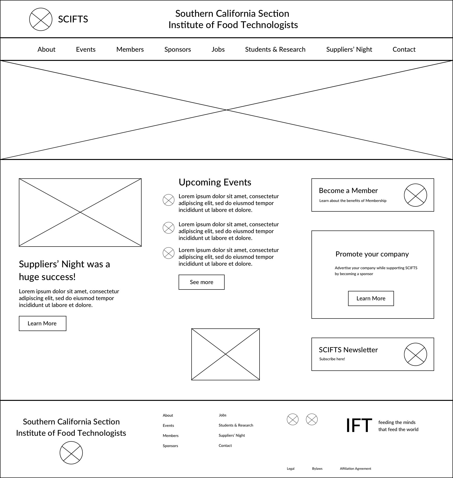
The following wireframe prototype was iterated upon multiples time before moving onto the higher fidelity versions. This explains why the wireframes have a different layout compared with the hi-fi versions.
Overall, this wireframe usability test showed participants were able to achieve the goals of each task very effectively. While there were some minor issues here and there, they mostly stemmed from the prototypes being wireframes, so they were black and white only, had little font differentiation, and had minimal system status feedback.
The SUS (System Usability Scale) questionnaire showed the participants found the website to be very user-friendly. The scale is scored 0 to 100. The higher the score from participants, the more user-friendly the system. All scores were much higher than the system’s average of 68. One user reviewed the site with a perfect score of 100.
After the usability test was conducted, insights on what participants liked and didn’t like, as well as recommended changes and additions, were gathered and organized on an affinity wall. These notes were then reviewed and helped in discovering key findings.
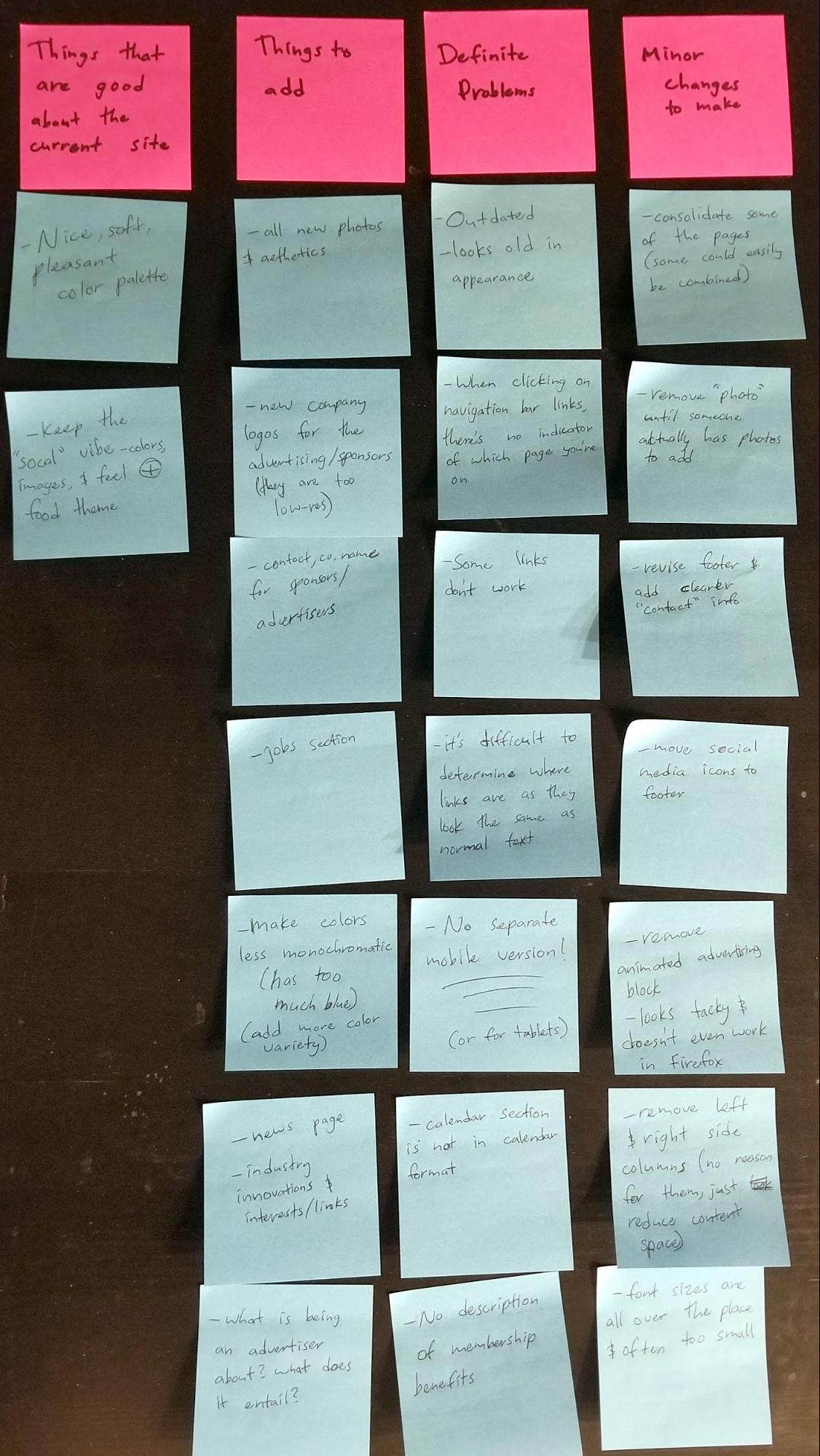
Figure 6: Affinity Wall
Problem 1
Severity: 3/4
The first problem a participant came across was that there was no indicator from the navigation bar once
they clicked on a link as to which page they were on. This was a problem found in the initial interview
on the already existing website.
Recommendation
This problem should be addressed with color and font changes in the higher-fidelity prototype.
Problem 2
Severity: 2/4
A participant noted that while there is an entire page devoted to Suppliers’ Night, it doesn’t actually
include a description of what the event is.
Recommendation
High-fidelity prototypes should include more details about Suppliers’ Night.
Problem 3
Severity: 2/4
A participant noted that the membership page doesn’t detail the benefits of being a member very well.
Recommendation
High-fidelity prototypes should include more details about membership benefits.
Problem 4
Severity: 1/4
A participant was unaware of the modern convention that clicking on a header’s logo will take them to
the homepage. As including a “home” link on the navigation bar has widely been accepted as unnecessary,
other options will be explored.
Figure 7: Circle with “x” wasn’t apparent as representing a logo to all test participants
Recommendation
I noticed a user tried to click the header, expecting there to be a link to take them to the homepage.
Only the logo was set up to link to the homepage. One solution would be to make the entire header area
take you to the homepage rather than just clicking on the logo. Another solution could simply be to make
the low-fidelity logo more obvious that it’s a logo by writing the word “logo” inside the circle. It’s
possible the user would be more inclined to click the logo if it were obvious that it’s a logo.
Problem 5
Severity: 1/4
A participant noted that the “click here to purchase [the SCIFTS newsletter] subscription online” link
was just text instead of a button like all similar links.
Recommendation
The next iteration should change this text to instead be a button that looks like the rest of the
buttons, better communicating to users where to purchase a newsletter subscription.
When a user clicks on an event on the events calendar, more detailed information is displayed, including an address for the event location. A participant recommended adding a google map image link, so the user would be able to quickly see the address in relation to a larger area the user is more familiar with. They can then better plan their trip. Another request from a participant was to change the name of the button on the About page from “Visit IFT to become a member” to “Sign up for SCIFTS & IFT Membership.” This makes it more clear that visiting the IFT website is where signing up for SCIFTS takes place. Another participant wondered if the site might benefit from a search bar. I took this into consideration and performed more research on the subject. This is discussed later in this report.
One limitation is the number of participants for the usability test. Typical tests require anywhere
from five to ten participants, sometimes more. This test had only a few participants. That said,
participants came from a variety of backgrounds and provided a picture of the general sentiment of using
the site and actionable change recommendations.
Another limitation is that feedback from the system was not included with this prototype (which page the
user is on was not yet
indicated in the navigation bar). This was added in later versions.
Finally, some buttons were hard to locate because the wireframes are in black and white only, and they
didn’t
stand out as well as they will when color will be added.
Participants were able to easily navigate through the website and find what they needed in nearly every task. The problems needing changes were updated in the next prototype version, and font, color, and layout changes were applied.
Moving forward from wireframes to a medium-fidelity mockup, there are some design goals I kept in mind. I wanted the spirit of the original website to come through in the sense that the organization is Southern California-based. I used pictures I found from free stock image websites such as Unsplash. The buttons are a light blue color, representing the ocean and sunny skies. The other main color used was green, representing organic material.
Something that I changed from the current website was to make more of an emphasis on a food aesthetic. There are several photos and graphic designs of food used throughout the website. For the logo, I used the original IFT logo and put blue S’s and C’s around it to complete the “SCIFTS” logo and and emphasize the Southern California section of IFT. I used a lot of whitespace for the background to give the site a simple, clean, and uncluttered feel.

Figure 8: New button aesthetics for the site
Figure 9: New logo design for SCIFTS
The next step was to develop the wireframes into medium-fidelity mockups. Color, different fonts, and more details were added to each webpage. Some details and making the designs interactive were not yet implemented. Once the next mockup iteration was ready, I performed a UX heuristic analysis on the designs based on Jakob Nielsen’s “10 general principles for interaction design.” The below findings indicate heuristics that were violated and recommendations on how to fix them for the next iteration that would be viewed by test participants.
Finding 1:
The events page doesn’t display enough information about each event.
Severity: 3/4
Heuristic Violated: #2 Match Between the System and the Real World
This version of the website has links to get to the Events page and calendar. However, when clicking on
an event, all it reveals is the date and location. This is important information, but more details need
to be displayed. Users would expect a website to display details of an event, so there is a violation
between the system and what is expected.
Recommendation
High-fidelity prototypes should include more details about Suppliers’ Night.
Finding 2:
There is no indication on the Sponsors page of how to actually become a sponsor.
Severity: 3/4
Heuristic Violated: #2 Match Between the System and the Real World
The person to reach out to, who handles sponsorships and advertising, is located on the Members page,
not the Sponsors page. There is a mismatch between the system and users' expectations to find out how to
actually become a sponsor because there is no information on this on the page one would most expect it,
the Sponsors page.
Recommendation
The next version should have information on the Sponsors page of how to reach out and become a sponsor
of SCIFTS.
Finding 3:
On the About page, the sign up for membership button is a bit far down the page.
Severity: 2/4
Heuristic Violated: #5 Error Prevention
It’s important that all information needed is found easily. It’s possible that having the sign up button
too far down on the About page may cause users to miss it.
Recommendation
The button should be moved farther up the page, so it’s as easy to find as possible. This should reduce
errors of users not finding the button.
Finding 4:
Links and email addresses throughout the site don’t display a different color from other text.
Severity: 2/4
Heuristic Violated: #2 Match Between the System and the Real World
It’s modern convention that emails and links are a different color from the rest of the text on a page.
This points out to users that they are clickable, and open up your email to send a message, link to a
different location on the site, or link to a different site altogether.

Figure 10: Links are the same color as all other text
Recommendation
The emails and links should be changed to a blue color, following modern conventions.
Finding 5:
Sponsor type titles on the Suppliers’ Night page are too small.
Severity: 1/4
Heuristic Violated: #7 Flexibility and Efficiency of Use
The sponsor type titles on the Suppliers’ Night page are a bit on the small side, and should really pop
out to the user. Easier readability leads to an increased efficiency of finding the information a user
needs. Also, sponsors who donated a larger amount appreciate it being known what type of sponsor they
are.
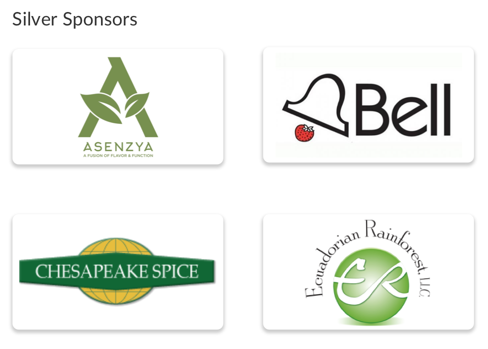
Figure 11: Sponsor titles (“Silver Sponsors”) are too small
Recommendation
The font size of the sponsor type titles should be increased and moved to the page’s center.
Finding 6:
Having the job links on the Jobs page all the same color could lead to misclicks.
Severity: 1/4
Heuristic Violated: #5 Error Prevention
Having each job posting’s button the same color on the Jobs page may cause some users to get lost or
click on the wrong job when reading through them.
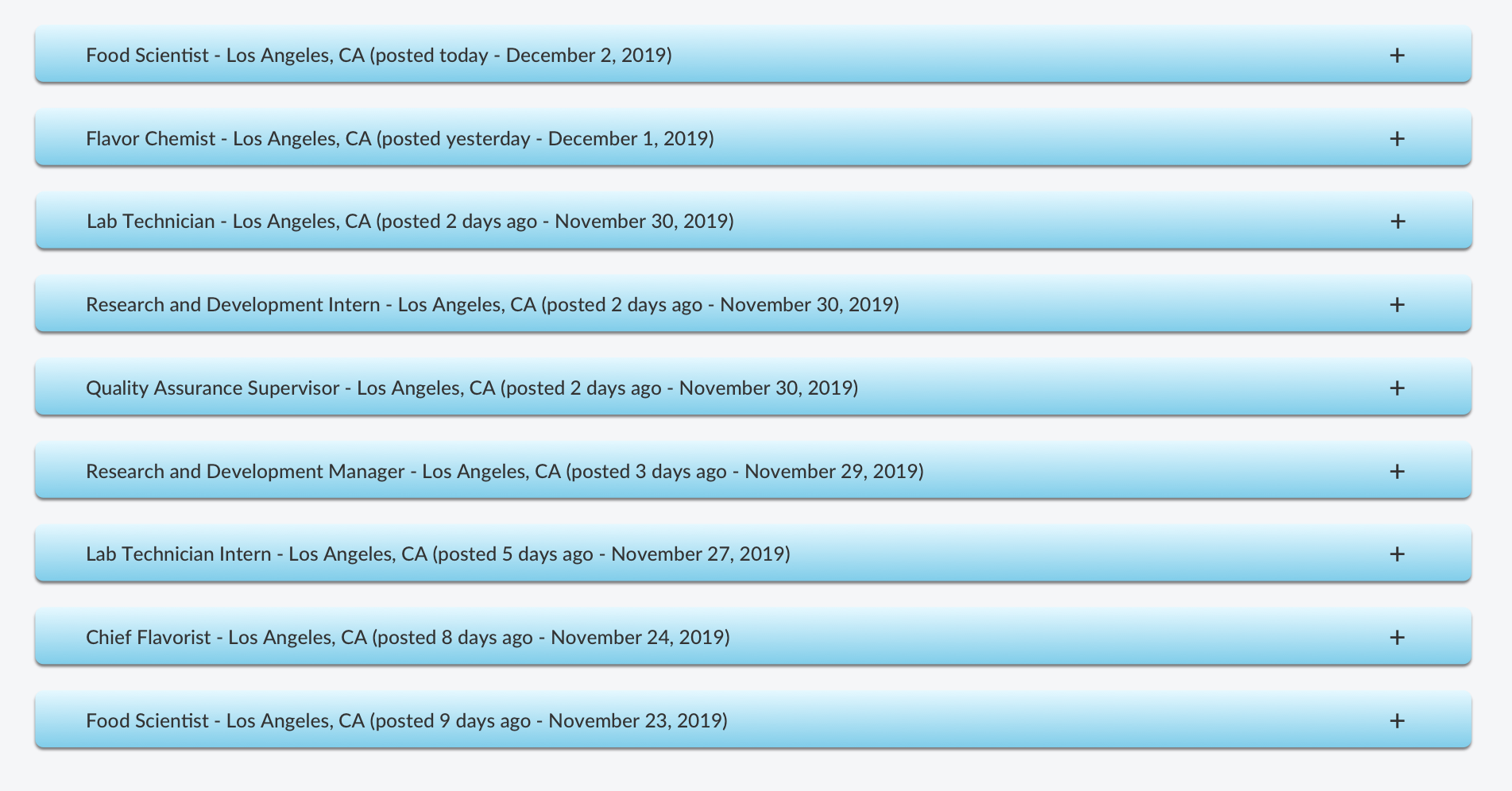
Figure 12: Jobs page listings, all one color
Recommendation
The colors of the buttons should be changed so they alternate colors. The buttons could be blue, then
green, then blue, then green, and so on. This extra organization should help users read the content
better and click where they actually intend to.
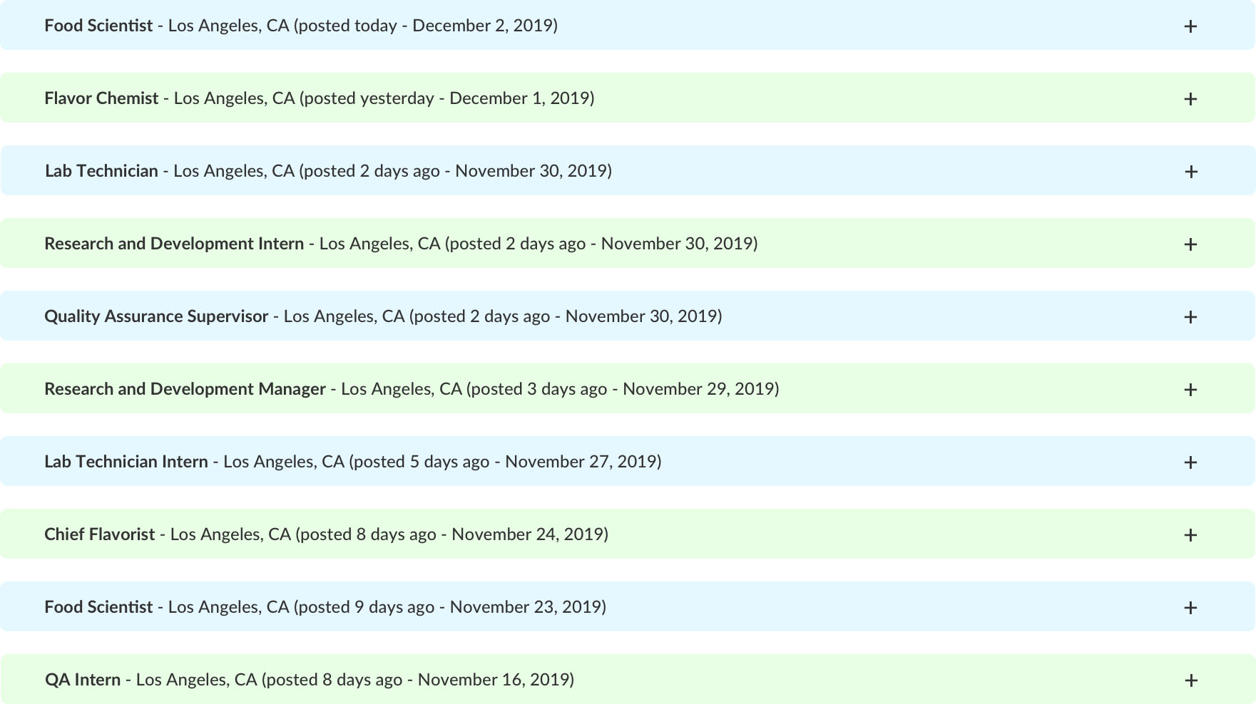
Figure 13: Jobs page listings, colors alternating and shadows removed for clarity of reading
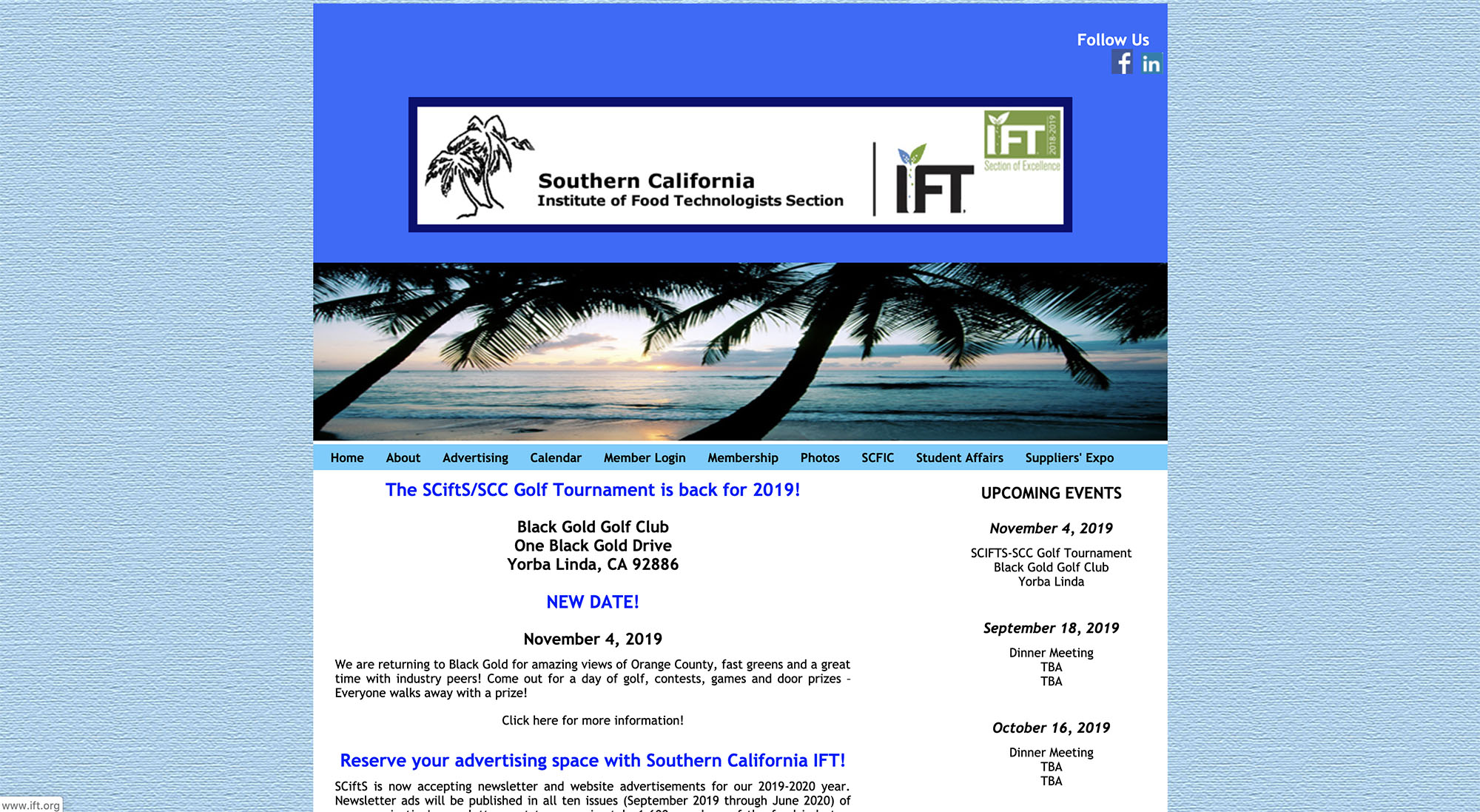
Figure 14: Post Heuristic Evaluation SCIFTS Homepage
Figure 15: Post Heuristic Evaluation SCIFTS Homepage
The purpose of this test was to find out if there were new or additional pain points in the user experience for the higher-fidelity SCIFTS website prototype since design became more detailed. Ideally, things should become clearer and easier to navigate with the addition of more detailed visual design. It is possible, however, that some things could become more complicated on screen. This usability test would help determine if improvements had been made since the last test. Some tasks were revised and some were added to be more thorough. Like the first usability test, the tasks reflect activities users would want to accomplish when utilizing the website. These tasks were determined based on the earlier interviews, which informed the needs of the website.
I sought out some of the participants by reaching out to people I knew had used the current, live website and had an interest in wanting to see it improved. I also reached out to others who were not familiar with the current website or even SCIFTS in general. I believe it is beneficial to have ideas and responses come from those who use the website, as well as those who would be experiencing it for the first time.
- Prototype was developed using Sketch design software
- Prototype was made interactive with InVision software
- Macbook Pro Laptop: used by participants to access the wireframes and perform the tasks
- Present consent form and have participants sign
- Go through script with the participant
- Have participants perform tasks
- Participants fill out the posttest questionnaire
- Debrief and thank participants
After running the second usability test a couple times, I revised the tasks to be more clear. I added a couple more tasks and rearranged the order so they didn’t just go in the order of the navigation bar menu.
1) You’ve heard that networking at SCIFTS dinner meetings is a good way to get more involved in the food science community in Southern California. Find the IFT page where you would sign up to be an Institute of Food Technologists member.
2) You’re wanting a new food science job at a company in Los Angeles. You have about 1 year of experience. Find the phone number for a job contact for a Research and Development Intern position.
3) You want to host an event for SCIFTS. To reach out, find the SCIFTS official email.
4) You’re interested in the upcoming SCIFTS Golf Tournament event. You have a question if your beginner skill level is appropriate for the event. Locate the phone number for the Golf event’s SCIFTS organizer.
5) You need nutritional analysis performed on a food product you’re working on and want to support companies that sponsor SCIFTS. Find a website URL for a SCIFTS sponsor company that fulfills this goal.
6) You’re interested in learning more about grants awarded through SCIFTS. You’re curious about a ballpark of how much money might be granted to someone. Find how much grant money was awarded to Cal Poly San Luis Obispo and what project the grant money was awarded for.
7) You’d like to reach out to the person who is in charge of the SCIFTS LinkedIn page. Find the email for the person in charge of SCIFTS LinkedIn.
8) You’d like your company to be a sponsor for the upcoming Suppliers’ Night Expo. You’re curious about the different types of sponsors. How many different types of sponsors are there for Suppliers’ Night?
9) You are not a member of SCIFTS yet, but you want to check out the newsletter. What is the mailing address for sending a check to in order to subscribe to the SCIFTS Newsletter?
10) You are planning to get a Master’s degree in Food Science, but need financial help. Locate the SCIFTS scholarship information PDF.
This round of usability testing showed users were easily able to complete the tasks and find whatever information they needed. The tasks were completed even faster than in the first usability test. This makes sense as some of the problems in the original test were caused by not having distinguishing colors, fonts, and images to help users stay informed of where they were on the site, what constitutes a button, etc. The issues found in this test were relatively minor and most were due to subjective aesthetic preferences.
The SUS (System Usability Scale) questionnaire showed the participants found the website to be very user-friendly. The scale is scored 0 to 100. The higher the score, the more user-friendly the system is ranked by the test participants. Like the first usability test, all scores were higher than the system’s average of 68. One user reviewed the site with a perfect score of 100 and multiple participants scored the website above 90.
Problem 1
Severity: 2/4
Member list on the Members page has no particular order. It’s difficult to find what you’re looking for.
Recommendation
The member list should be reconfigured into alphabetical order.
Problem 2
Severity: 2/4
A participant tried clicking on the Golf Tournament event on the homepage instead of the “see more”
button and nothing happened.
Recommendation
Clicking on each event on the homepage should take you directly to the event’s informational page
instead of having to click “see more” first and then finding the event on the calendar.
Problem 3
Severity: 1/4
Multiple participants felt the content was too low on the page in relation to the navigation bar.
Figure 16: Content starts too low on several pages
Recommendation
Content should be moved up closer to the page’s navigation bar on the problematic pages. Also, the
navigation can be condensed to save additional space. Example can be seeen below.
Figure 17: Top gap has been removed and navigation has been condensed.
Problem 4
Severity: 1/4
There are miscellaneous typos and some titles are still black (need to be green to be consistent).
Recommendation
Typos should be corrected, and all titles should be changed from black to green for consistency.
It took extra time for some users to complete task #6, which was locating the email for the person in charge of SCIFTS LinkedIn. This is probably due to the member roles not really having an intuitive order. A simple adjustment of switching to alphabetical order would fix this issue.
A couple users wondered if a search bar might be a helpful tool for the site. It is not unusual to include this feature on a website with hundreds or thousands of articles, but on a website with nine pages, including the home page, it seems unnecessary. The tasks were accomplished so quickly that it reflects users being able to find what they need without a search bar.
When people use a search bar, it needs to display results they were looking for. If it doesn’t actually show what they searched for, they are generally more frustrated than if there’s no search bar in the first place. If the SCIFTS site becomes much bigger, with lots more content, a search bar could potentially be added.
One way to help alleviate the need for a search bar is to have alternate ways to navigate to specific locations. If someone clicks a link on the navbar and it doesn’t take them directly to the content they intended, there’s a link on the page they went to which should get them there. For example, if one is trying to sign up for membership, one might think to click the Members page link. That page is actually about existing members, but there is also a link right at the top of the content of that page that will take users to the About page, where member sign up information is actually located.
Multiple users felt the Jobs page aesthetics were a bit whimsical. Muting the colors and removing the shadow should make them appear more professional.
One limitation, similar to the first usability test, was the number of users for the usability test. While this test did have several participants, some tests have ten or more, yielding more detailed results.
Participants were able to easily navigate through the website and find what they needed in each task. The few, minor problems needing changes were updated for the final version of this project.
While the designs for the new SCIFTS website are fairly detailed, there is always room for improvement. Even if these designs get developed and turned into a functioning website, the work is never done. Post launch, more testing could be performed in the form of A/B testing or Preference testing. Also, updating the website with new events and other content will always be required.
Some of the actual content itself could be reworded. Jakob Nielsen’s principles for interaction design describe “Aesthetic and Minimalist Design” as, “Dialogues should not contain information which is irrelevant or rarely needed. Every extra unit of information in a dialogue competes with the relevant units of information and diminishes their relative visibility.” Following this guideline, I think some content could probably be reduced, leading to people actually reading more content.
One page that the current SCIFTS site has featured on the navigation bar that this new design doesn’t is the SCFIC (Southern California Food Industry Conference) page. A whole additional page based on one event may not be necessary. It could simply be added as an event on the events calendar.
Content that could be added would be additional information on membership benefits. While there is some information on the IFT website, more information on the SCIFTS website itself could be beneficial.
Finally, the most obvious and important next step would be implementing a responsive version of the site. The current site accessible on a phone or tablet is just a smaller version of the desktop site and has no separate designs (font is tiny, layout is poor for smaller screens). These initial designs were made for desktop because users interviewed said they typically accessed the site through desktop or laptop computers. However, it’s important for all modern websites to have responsive designs. Designs for mobile (or other sizes) could be implemented in the future, but it’s beyond the scope of this project.
Interview questions, SUS (System Usability Scale) questionnaire, consent form, and user test script available by request.
 Top
Top