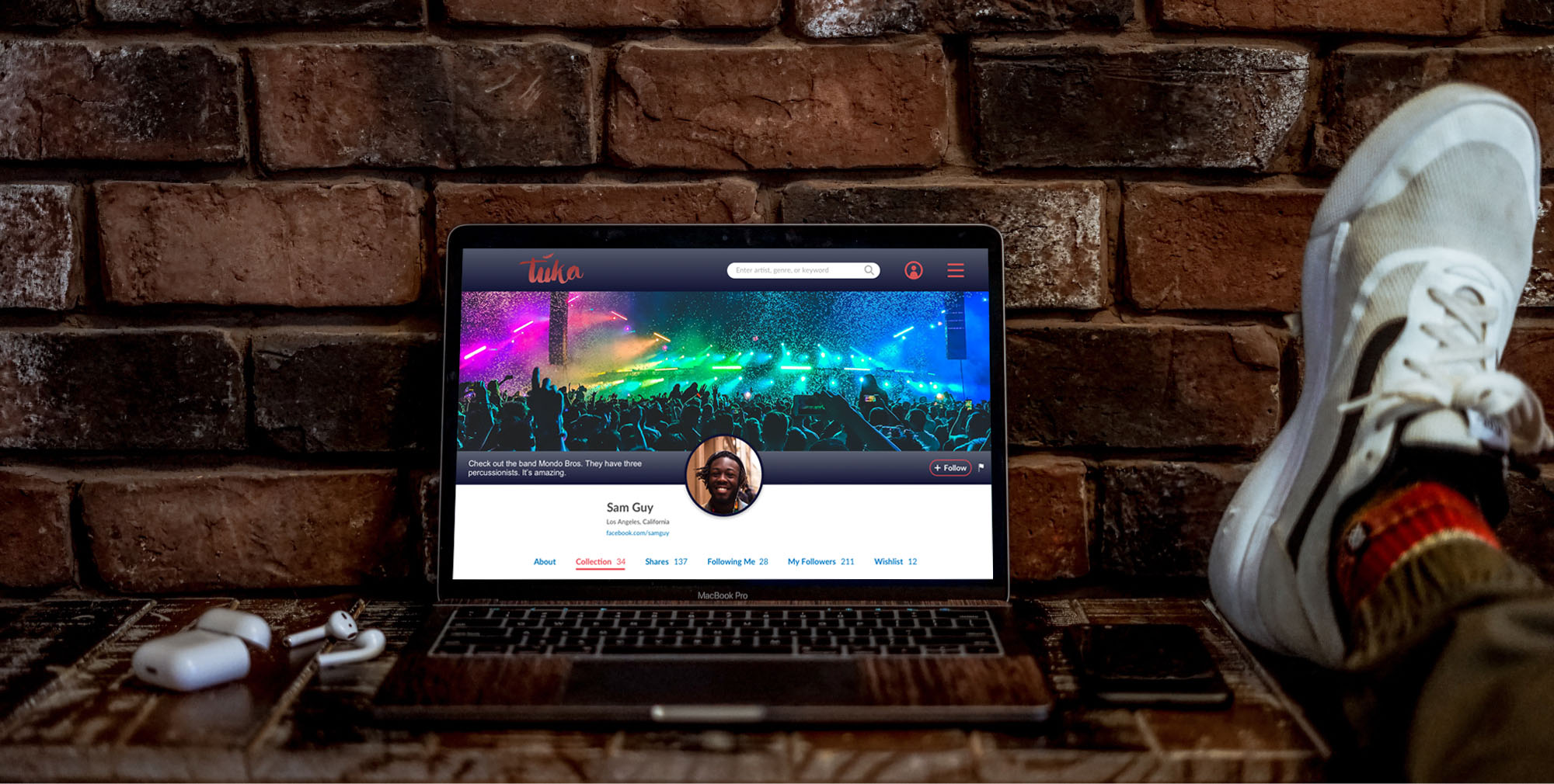

The overwhelming supply of creative content (such as music) makes it extremely difficult and costly to connect artists with their audiences and vice-versa.
Create a sustainable new online ecosystem that empowers not only creators and consumers, but also rewards curators of desired content. The goal is to help innovative creators thrive, and reward those who like to create and share content.
Work with developers and founder to launch music social media platform called tuka global
UX / UI Designer: design user interface for the platform
Sketch, Photoshop, Illustrator, InVision, Trello, Slack
(still in development)
~6 months
2019
I’ve always been interested in discovering obscure or relatively undiscovered music. Tuka global encourages and supports this as one of its main features. I’m also all for getting more revenue back into the hands of content creators.
Working with the company’s founder and CEO, I have continued to flesh out how tuka will best serve its users by providing content creators with more value than competitors, better content discoverability, and how to best connect content creators with their fans. When I joined the tuka global startup, UX Designers had already performed some of the research required to establish early concepts. It was my job to then take this research into consideration and iterate on the existing designs.
The below images are the current designs expected to be used for the MVP (minimum viable product). All designs are open to additional changes at any time.
The homepage is meant to be a basic introduction to tuka. Users are able to immediately start discovering music. After purchasing music, and thus supporting artists, fans may then share content they like. Recommending music to others helps connect communities, supporting artists and helping fans find new music. The tagline “Discover • Share • Connect” reflects the goals of tuka.
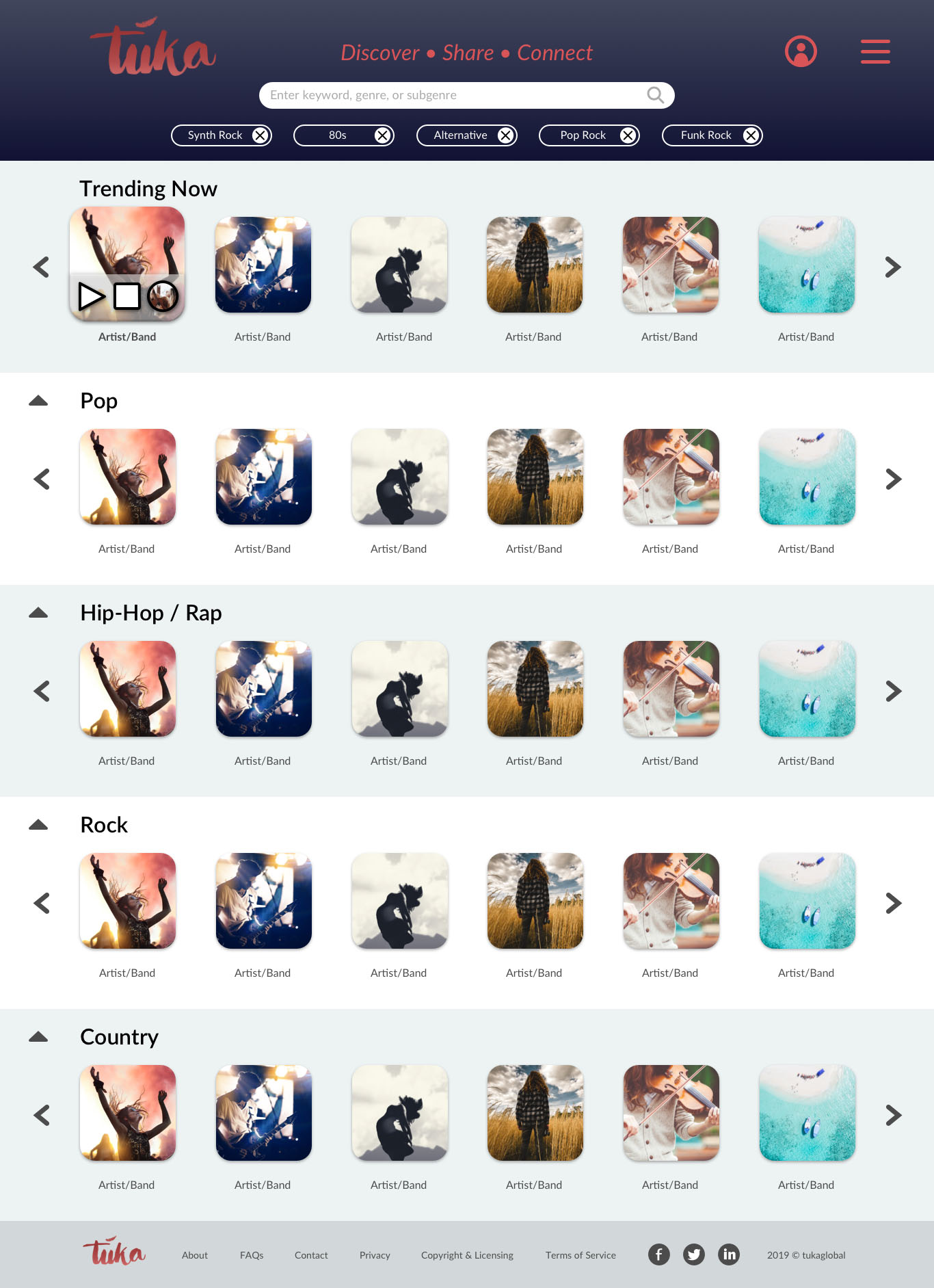
Figure 1: Homepage design
Users can discover music right away, but to begin purchasing content, they need to sign up. The below sign up pop-up includes modern conventions such as confirming both email and password, responding to the captcha, providing terms of use and privacy policy, and an option to log in if users already have accounts. It includes the necessary functionality, while also maintaining tuka’s overall aesthetic.
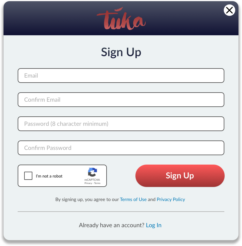
Figure 2: Sign up pop-up
Once users sign up, an email confirmation pops up. This notifies users to check their email and confirm their account. Always keeping the user experience in mind, there’s an option to resend the confirmation email and a reminder to check their spam folder.
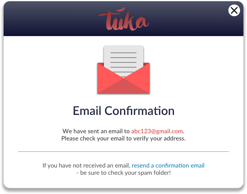
Figure 3: Email confirmation pop-up
Users will confirm their account when they receive an email. Included is the option to contact support if there are any issues.
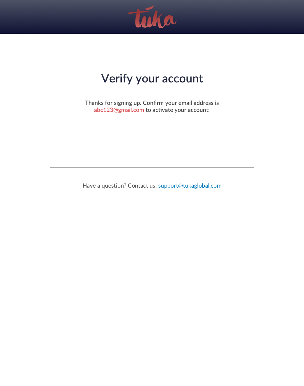
Figure 4: Confirmation email
Once users click “Verify your account” in the email, they will be taken to a new tab of tuka, where they will be prompted to log in for the first time. Once logged in, the account confirmed pop-up will display.
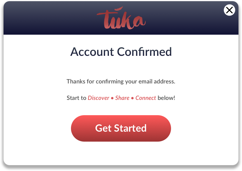
Figure 5: Account confirmed pop-up
Below is an example of a user page. It’s early in development and user needs are still being worked out. Some features are a display of the user's collection, the user feed, and options for the user to make a post, share links, and offer other information.
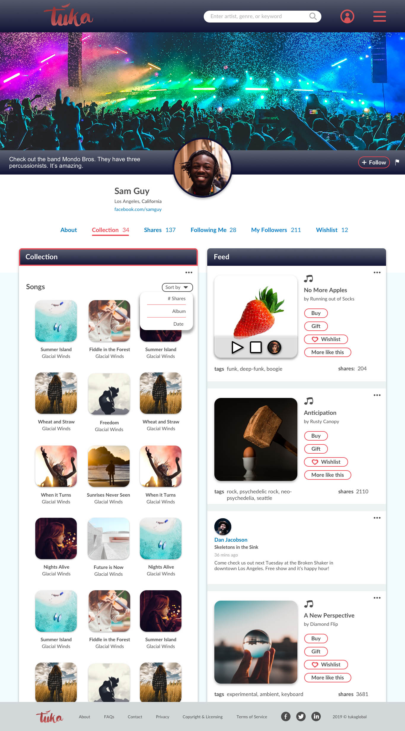
Figure 7: Content creator page
These are a few of the logo ideas for tuka. The logo is still in development and will most likely undergo several more iterations before landing on the right one. They were designed with Sketch and Adobe Illustrator.
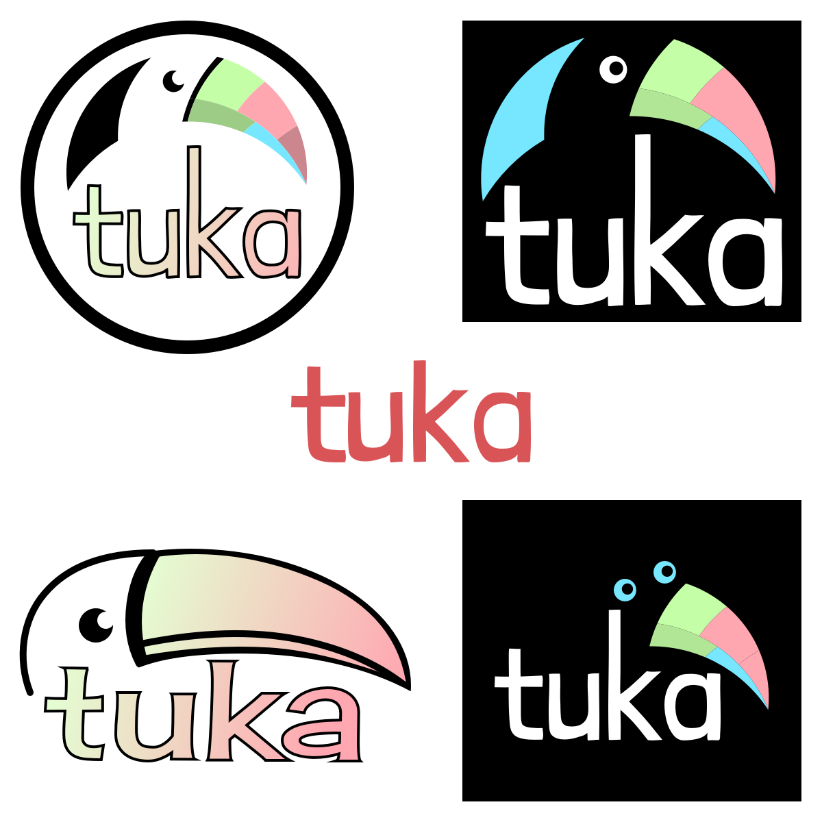
Figure 8: Various logo ideas
Below is an assortment of icons used for tuka UI. They were built in Sketch.
Figure 6: Miscellaneous icons